brand guidelines
Welcome to our brand guidelines, a digital tool we’ve created to help make it a little easier for you to maintain our brand.
Here you'll find the foundational elements that create our Arlequin brand identity. Consistency is key in keeping our brand presence strong. Consistent and repetitive usage of these elements will create lasting recognition and a memorable connection with our audience.
logo
Our logo is the most important representation of the Arlequin brand and may be used in two formats.
PRIMARY LOGOS
Our master logo contains the full Arlequin name and the logo symbol contains our 'A' emblem.


MASTER lOGO
As often as possible, our master logo should be used in our primary green brand color over our yellow background color. This may be reversed when appropriate. Black and white logos are used when color is not applicable.


logo SYMBOL
There are instances where the 'A' logo symbol may be used on its own. Careful consideration should be taken when using the symbol instead of the master logo. To help decide, ask yourself: Will my audience know the 'A' stands for Arlequin? Is the written name “Arlequin Wine Merchant” in close enough proximity for reference? The symbol may be used for social media profile avatars, internal branded schwag, and on-location branded collateral.


CORRECT LOGO USAGE
- Our logo should be used as often as possible with our primary green and yellow brand colors.
- The yellow logo is used on the green background color only.
- The green logo symbol should be used on the yellow background.
- The yellow logo symbol should be used on the green background.


INCORRECT LOGO USAGE
- Do not use our logo over any color other than our primary green and yellow brand colors.
- Do not use our logo without the secondary text.
- To avoid repetition, do not use our logo and logo mark in close proximity to one another
- Do not change the size of the secondary text in relation to the primary text.


color
Our brand color palette reflects friendly warmth and creates a seamless experience with our Arbor neighbor. Arlequin shares the same color palette with Arbor, but its usage is flipped in hierarchy.
PRIMARY COLORS
Green and Yellow are our primary brand colors. Green is used for the logo while Yellow is used as a background fill.
SECONDaRY COLoRS
Terracotta and Cream are our secondary brand colors. Terracotta is used sparingly for pops of color to attract users to a CTA or enticement amongst the primary brand colors. Cream is used to add warmth to backgrounds and to provide breaks to the yellow background color where needed.
COLoR USaGE RATiO
This ratio shows how much you should use each of our brand colors. Green and Yellow are used most often, whereas Terracotta and Cream are used less often.
typography
'Tenor Sans' and 'Brandon Grotesque' are our two brand fonts. Tenor is used for headlines while Brandon is used for paragraph text. This provides style and legibility.
PRIMARY FONT
Display headline.
Secondary headline.
Paragraph text, gravida mi nibh, a auctor enim tempor non. Sed non ultrices neque. Nunc lectus lorem, condimentum vitae sem sit amet, lobortis ullamcorper nisi. Nam odio lorem, varius vel lacus id, ullamcorper suscipit arcu. Praesent vel diam nec augue porttitor molestie. Nam sed justo ac est sodales hendrerit quis nec eros. Mauris non massa vitae nunc tincidunt egestas. Vivamus enim nulla, pellentesque id pharetra sed, lacinia at nulla. Maecenas nec suscipit libero. Nunc tempor nulla eu urna tempor, ut pharetra nulla pretium.
photography
Our photography should always align with our brand personality. All photos should be: simple & curated, casual & comfortable, approachable & friendly.
photography art direction
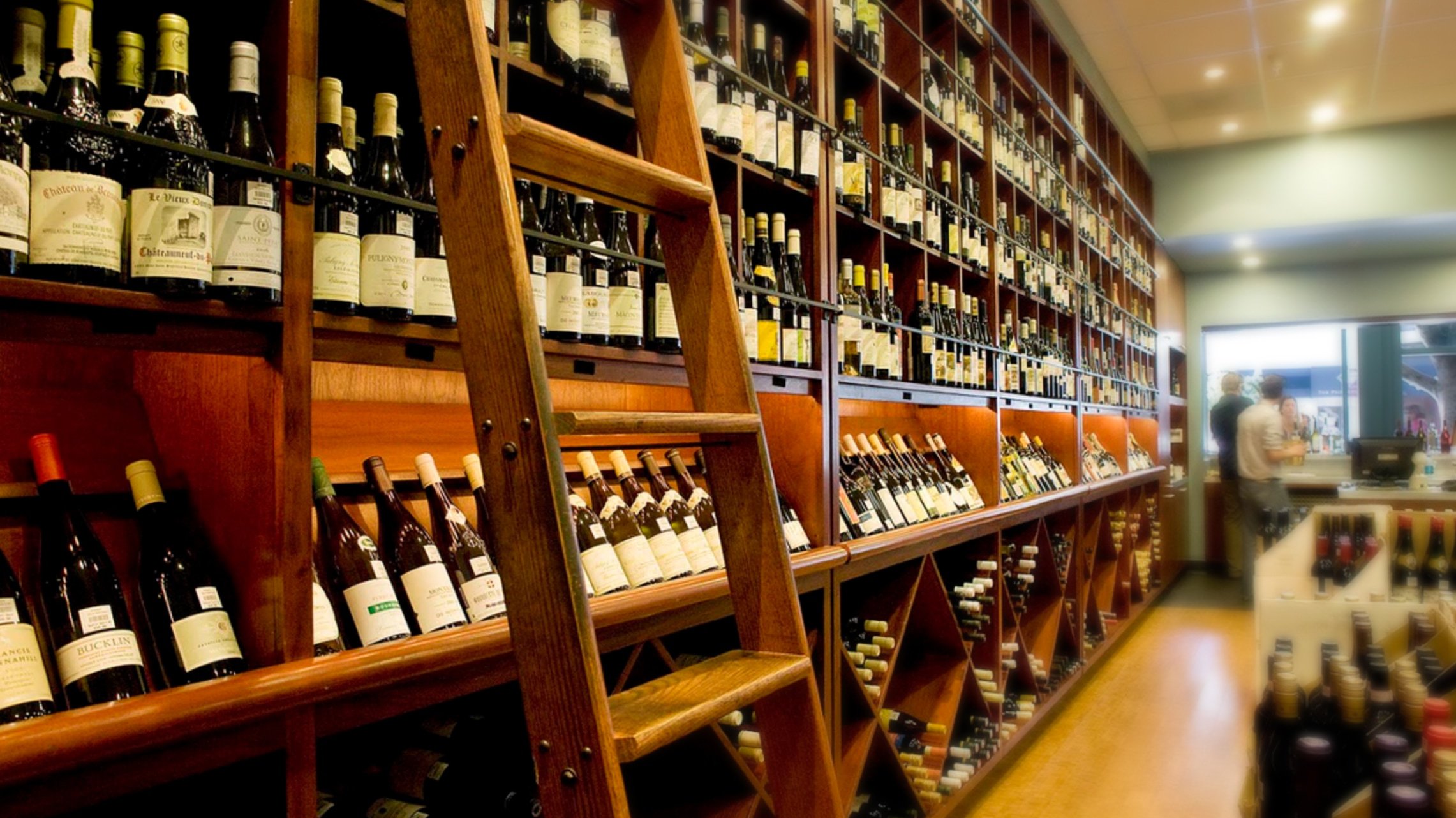
- PHOTO SAMPLE 1
Capture details like ladder, natural woods and patio greenery to display the unique setting. - PHOTO SAMPLE 2
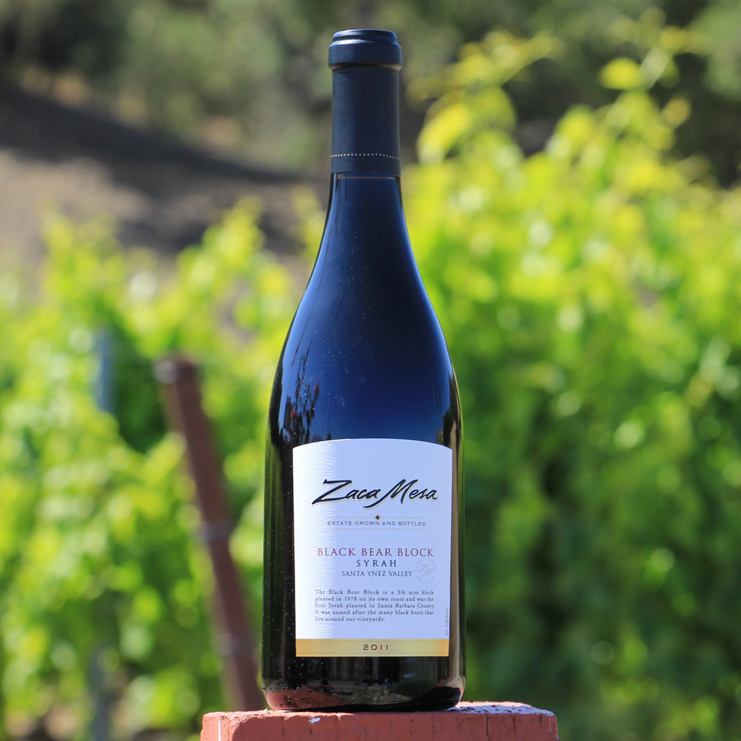
Soft focus greenery background presents sense of place, with added focus and a quick-read on the product. - PHOTO SAMPLE 3
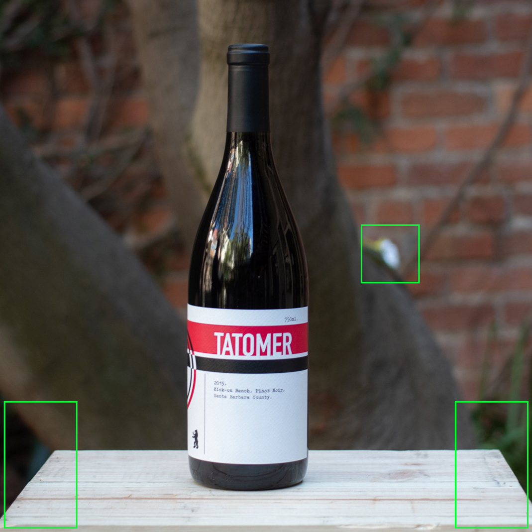
Simpler backgrounds with very soft focus provide the best contrast. All shots should share the same background to avoid distraction with in a grid of many products. - PHOTO SAMPLE 4
Avoid distracting tangents in back drop setup that distract the eye when scanning many products within a grid.